![]()
Sponsored By
ROCK
HARDWARE
Chockstone Photography
Australian Landscape Prints |
 Chockstone Forum - General Discussion
General Climbing Discussion
| Topic | Date | User |
| OT: Moorabal/Lal Lal wind farm | 29-May-2009 At 10:34:45 AM | TonyB |
| Message | ||
| Data below (blue spots) is monthly global temperature data taken from Hadley Centre / UK Met Office / IPCC. Red lines show temperature trends. Data is over a 30 year period for each graph. One graph is the past 30 years. The other graph is for a much earlier 30 year period, before the major increase in man's CO2 output. ( I hope that is explicit enough ?) Possible responses: a) Left graph shows greatest warming b) Right graph shows greatest warming c) There is no discernable difference in the rate of warming over the past 30 years and the much earlier 30 year period. 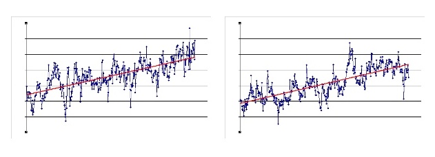 |
||
Home | Guide | Gallery | Tech Tips | Articles | Reviews | Dictionary | Forum | Links | About | Search
Chockstone Photography | Landscape Photography Australia | Australian Landscape Photography | Landscape Photos Australia
Please read the full disclaimer before using any information contained on these pages.
Australian Panoramic |
Australian Coast |
Australian Mountains |
Australian Countryside |
Australian Waterfalls |
Australian Lakes |
Australian Cities |
Australian Macro |
Australian Wildlife
Landscape Photo |
Landscape Photography |
Landscape Photography Australia |
Fine Art Photography |
Wilderness Photography |
Nature Photo |
Australian Landscape Photo |
Stock Photography Australia |
Landscape Photos |
Panoramic Photos |
Panoramic Photography Australia |
Australian Landscape Photography |
High Country Mountain Huts |
Mothers Day Gifts |
Gifts for Mothers Day |
Mothers Day Gift Ideas |
Ideas for Mothers Day |
Wedding Gift Ideas |
Christmas Gift Ideas |
Fathers Day Gifts |
Gifts for Fathers Day |
Fathers Day Gift Ideas |
Ideas for Fathers Day |
Landscape Prints |
Landscape Poster |
Limited Edition Prints |
Panoramic Photo |
Buy Posters |
Poster Prints